Identity
At the center of our brand identity system is the logo. It is the simplest representation of our brand encompassing who we are, what we do, and how we're different.
Logo
Bold colors make a visual statement, emphasizing our impactful trait. When applied to the shape of the logomark these colors form a dimensional cube alluding to the building blocks of science and illustrating our curious and visionary nature.
The lowercase “b” seen in white is also an abstract rendering of a beamline at the National Synchrotron Light Source II, while the outer perimeter echoes that of the Electron-Ion Collider.
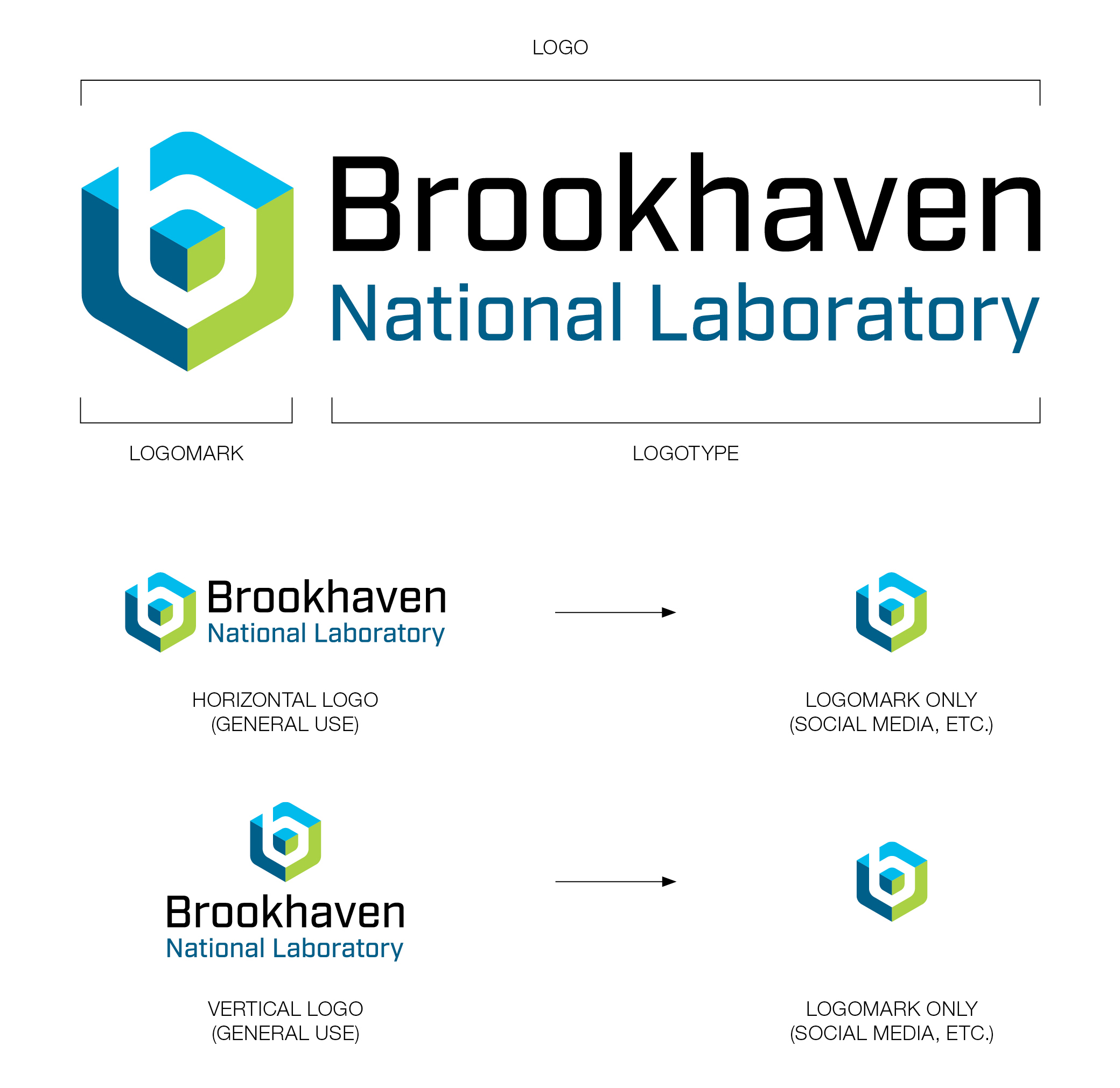
Our logo is comprised of two parts: the logomark and the logotype. This allows for more flexible use, including for websites and social media.
Download RGB Color Logos
RGB (Red, Green and Blue) is the color space for digital images. Use the RGB color mode if the logo will be displayed on a screen.
- Horizontal RBG Logo (.eps)
- Horizontal RGB Logo (.jpg)
- Horizontal RGB Logo (.pdf)
- Horizontal RGB Logo (.png)
- Horizontal RBG Logo (.svg)
- Vertical RBG Logo (.eps)
- Vertical RGB Logo (.jpg)
- Vertical RGB Logo (.pdf)
- Vertical RGB Logo (.png)
- Vertical RBG Logo (.svg)
Download CMYK Color Logos
CMYK (Cyan, Magenta, Yellow, Key/Black) is the color space for printed materials. Use the CMYK file format if the logo will be printed with physical ink.
- Horizontal CMYK Logo (.eps)
- Horizontal CMYK Logo (.jpg)
- Horizontal CMYK Logo (.pdf)
- Vertical CMYK Logo (.eps)
- Vertical CMYK Logo (.jpg)
- Vertical CMYK Logo (.pdf)
Including custom logos and graphics
Black, Grayscale, and White
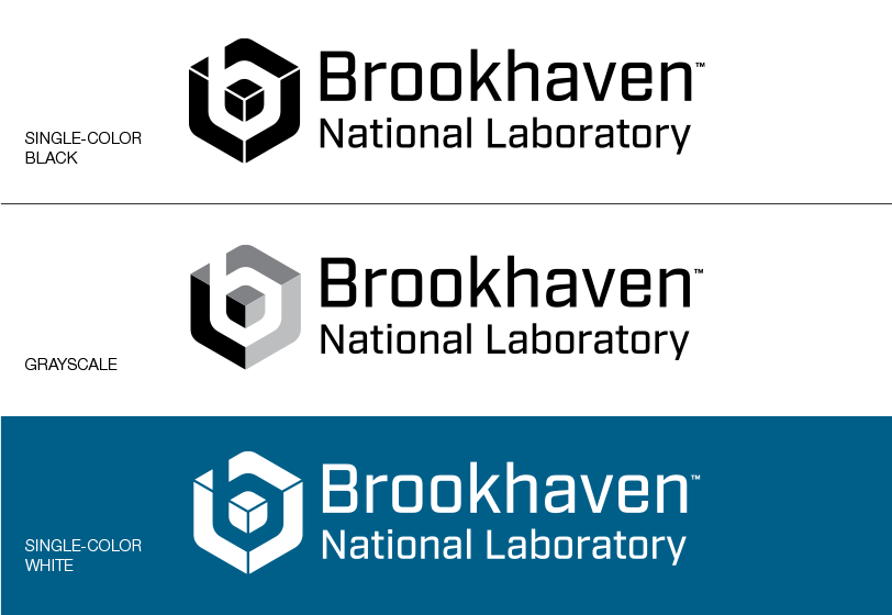
The grayscale version of the logo maintains the three sides of the cube with varying shades of black.
Lines defining the edges of the cube are added to the singlecolor- black and single-color white versions of the logo to maintain its dimensionality.
These single-color logos, along with the acronym logos on the previous page, will be used sparingly and only accessible on an as-needed basis.
Download Grayscale Logos
- Horizontal Grayscale Logo (.eps)
- Horizontal Grayscale Logo (.jpg)
- Horizontal Grayscale Logo (.pdf)
- Horizontal Grayscale Logo (.png)
- Horizontal Grayscale Logo (.svg)
- Vertical Grayscale Logo (.eps)
- Vertical Grayscale Logo (.jpg)
- Vertical Grayscale Logo (.pdf)
- Vertical Grayscale Logo (.png)
- Vertical Grayscale Logo (.svg)
Download Black Logos
- Horizontal Black Logo (.eps)
- Horizontal Black Logo (.jpg)
- Horizontal Black Logo (.pdf)
- Horizontal Black Logo (.png)
- Horizontal Black Logo (.svg)
- Vertical Black Logo (.eps)
- Vertical Black Logo (.jpg)
- Vertical Black Logo (.pdf)
- Vertical Black Logo (.png)
- Vertical Black Logo (.svg)
Download White Logos
- Horizontal White Logo (.eps)
- Horizontal White Logo (.png)
- Horizontal White Logo (.svg)
- Vertical White Logo (.eps)
- Vertical White Logo (.png)
- Vertical White Logo (.svg)
Clear Space
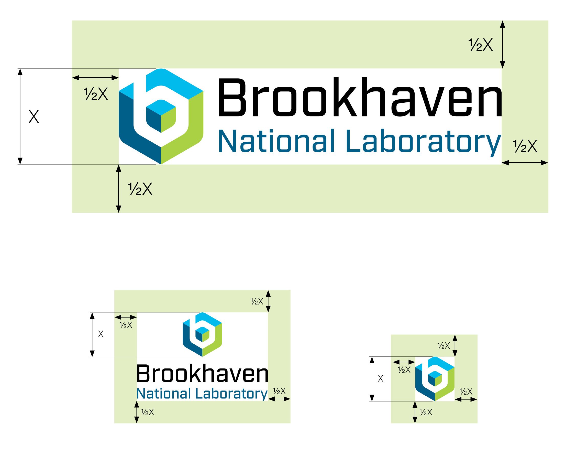
It is important to leave adequate space around the logo to set it apart and frame it within a layout. The dimensions shown on the right represent the minimum amount of clear space needed around the logo.
Leave clear space equal to at least 1/2 the height of the outer cube from all sides of the logo. Whenever possible, try to use more space to give the logo more prominence.
Partner Co-branding
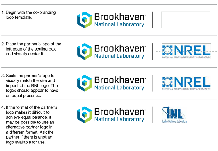
Co-branding treatments demonstrate collaboration and feature the Brookhaven Lab logo with that of one of our partners. A great deal of science, strategy and financial considerations go into co-branding relationships. Therefore equal emphasis should be given to both partners' logos.
When creating a lockup with a partner logo, place the Brookhaven Lab logo on the left and the partner logo on the right, separated by a thin divider line.

Logo Misuse
Maintaining the integrity of the Brookhaven Lab logo is key to building a strong identity. Care must be taken to ensure correct and consistent use in every application.
To ensure the brand's effectiveness always use approved artwork and never recreate, redraw, or cut and paste from secondary sources.


Swag Guidelines
Below are the three easy steps to submit your proof for approval:
- Review the swag guidelines document (PDF) for proper logo usage .
- Submit artwork to your vendor. Various versions of the Lab logo can be found in the logo section above. Be sure to require a proof before printing.
- When you receive the proof, submit it to our Brand Team for approval. Please allow 1-2 business days for approval.
After you receive approval from the Brand Team, you can give the vendor permission to print your items.
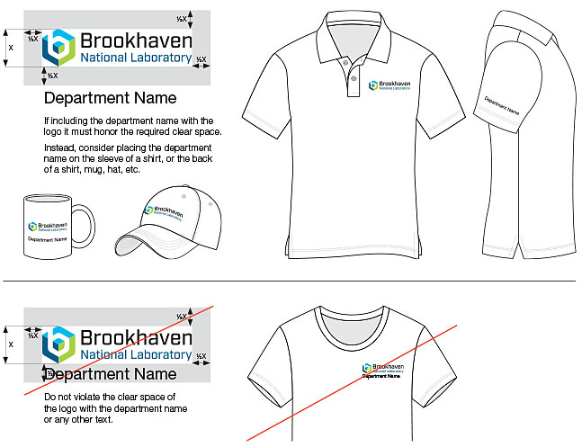
Please take careful consideration not to "lock up" the logo with your directorate name. Guidance on how to comply with this requirement is listed in the attached document. If you need help, the Brand Team can assist you with your artwork to ensure it meets the Lab's Brand Guidelines.
