Typography
Typography is part of our message. It conveys our personality, our attitude. It is part of how we tell our story.
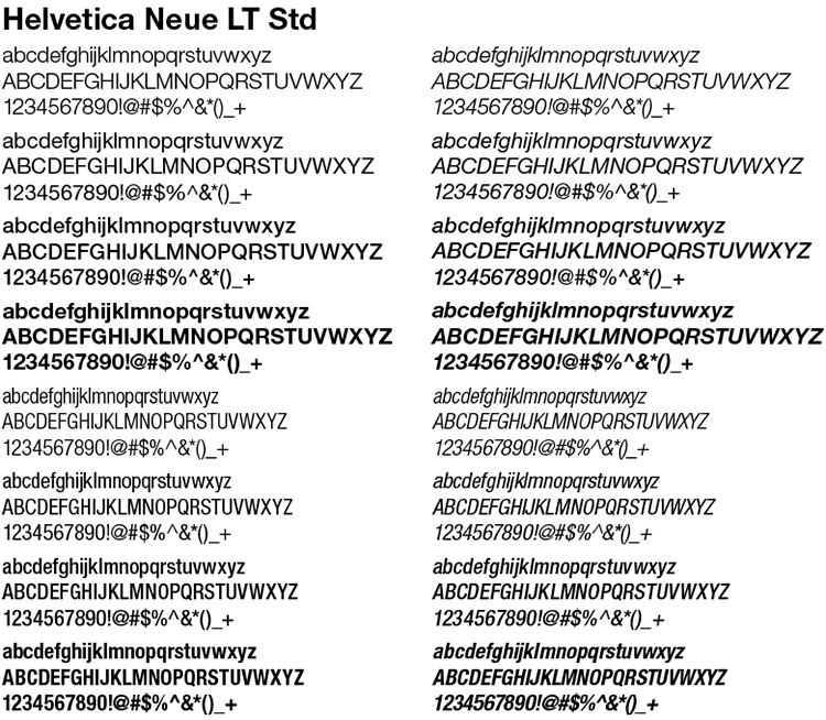
Primary Font
Helvetica Neue LT Std offers a wide range of weights and widths. The primary typeface should be used in all external communications. For compatability, any internal documents that may be edited externally should use our secondary typefaces, Helvetica or Arial, depending on system platform.
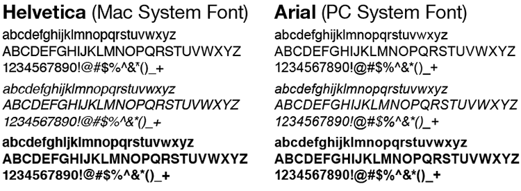
Secondary Font
Both Helvetica and Arial are standard desktop fonts and share a similar look and feel to Helvetica Neue LT Std. Helvetica and Arial should be used for all day-to-day business communications created in desktop programs such as PowerPoint and Word. Additionally, when using Helvetica Neue LT Std on the web is not possible, use Arial— a standard web font.
A full range of accents and alternate characters exists within the primary font family to put many Roman-based languages into typeset copy. When translating documents into other languages, please refer to the alternative typefaces listed here.
For any languages not listed on this page, or if the recommended typeface is not available, Arial Unicode may be used. Arial Unicode is available in a diverse set of non-Roman character families and is readily accessible on a global basis.
Use Primary For:
| Afrikaans Albanian Basque Breton Danish |
Dutch English Faroese Finnish French |
Gaelic German Greenlandic Icelandic Irish |
Italian Luxembourgish Malagasy Norweigian Portugese |
Spanish Swahill Swedish Turkish Walloon |
Use DFHS Gothic or Shin Go for: Japanese
Use Arial Unicode for:
| Korean Simplified Traditional Chinese |
Standards & Specs
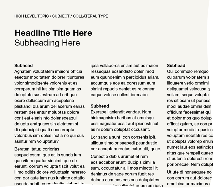
High-level topic
- Primary font, Roman, All caps
- 9 pt. for letter size and A4 applications
- Tracking between 0 to 10
Headline
- Primary font, Bold, Title case
- 20 pt. for letter size and A4 applications
- Type size will depend on application
- Tracking between 0 to 10
Secondary Headline
- Primary font, Roman, Title case
- 20 pt. for letter size and A4 applications
- Type size will depend on application
- Tracking between 0 to 10
Subhead
- Primary font, Bold
- 10 pt. for letter size and A4 applications
Body copy
- Primary font, Roman
- 10 pt. for letter size and A4 applications
- Minimum 12 pt. leading, 14 pt. where possible
Paragraphs
- Text should be left aligned
Grid System
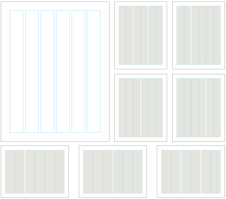
A flexible six-column grid system has been developed for use with Brookhaven Lab layouts. Document content may span across multiple columns, so long as all items orient to the underlying grid foundation. The illustrations included here show some of the possible grid configurations. Always allow for ample and consistent margins on a page, and include adequate white space when designing a document.
As with the consistent and proper use of color and type, using a standardized grid system creates visual unity across a variety of materials.