Color Palette
Color is feeling. It brings our ideas and our brand to life. Brookhaven Lab is vibrant and active, fueling transformation for companies—our color palette reflects that; it’s alive, inviting, curious and exciting.
Primary Palette
Each of our brand attributes are reflected in the selected palette. Our digital-friendly colors stem from hex values to effectively communicate via web, video, social media, etc. as this is the future of communication. The first three colors of the primary palette—teal, cerulean and lime—are the principal colors as they are found in the logo. These are to be used first and foremost. The orange and fuchsia are to be used only if a 4th and 5th color are needed.

TEAL

CERULEAN

LIME

ORANGE

FUCHSIA
Principal colors
Secondaries
Digital Palette
The first three colors of the primary palette—teal, cerulean and lime—are the principal colors as they are found in the logo. These are to be used first and foremost. The orange and fuchsia are to be used only if a 4th and 5th color are needed.
The secondary palette is to be used sparingly as accent colors to support the primary palette, namely the three principal colors.
The digital palette is vibrant and saturated. The graphics to the right provide color formula standards for web, video, social media, etc. Always use these formulas when producing digital communication products.
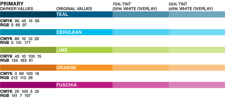
PRIMARY
TEAL
RGB 16 92 120HEX #105C78
CERULEAN
RGB 0 173 220HEX #00ADDC
LIME
RGB 178 211 59HEX #B2D33B
ORANGE
RGB 246 139 31HEX #F68B1F
FUCHSIA
RGB 183 36 103HEX #B72467
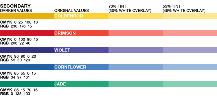
SECONDARY
GOLDENROD
RGB 255 205 52HEX #FFCD34
CRIMSON
RGB 219 53 38HEX #DB3526
VIOLET
RGB 81 73 158HEX #51499E
CORNFLOWER
RGB 72 129 195HEX #4881C3
JADE
RGB 37 181 116HEX #25B574
Print Palette
As result of the CMYK printing process, some colors of the print palette are slightly more muted. The charts to the right provide color formula standards for all print mediums. Always use these formulas when producing printed communication products.
PRIMARY
TEAL
CMYK 88 42 11 30PMS 7700 C
CERULEAN
CMYK 77 0 3 0PMS 638 C
LIME
CMYK 38 0 94 0PMS 2299 C
ORANGE
CMYK 0 49 96 0PMS 1495 C
FUCHSIA
CMYK 17 98 1 7PMS 675 C
SECONDARY
GOLDENROD
CMYK 0 16 89 0PMS 123 C
CRIMSON
CMYK 0 88 85 0PMS 179 C
VIOLET
CMYK 80 81 0 0PMS 2103 C
CORNFLOWER
CMYK 74 44 0 0PMS 660 C
JADE
CMYK 76 2 68 6PMS 2417 C
Tints & Shades
As accents for specific layouts, it is acceptable to use darker and lighter shades of the core colors. Some darker values are listed below. Tints can also be created by overlaying white or black in varying opacity.
Use these examples as a guideline.
Neutrals & Utility Grays
A variety of neutrals are available to offset color layouts, use as backgrounds and divide content.
NEUTRALS
CMYK 100 100 100 100RGB 0 0 0HEX #000000
CMYK 70 60 50 30RBG 76 81 90HEX #4C515A
CMYK 0 0 0 80RBG 88 89 91HEX #58595B
CMYK 50 40 40 5RGB 133 136 137HEX #858889
CMYK 30 20 25 5RGB 172 178 174HEX #ACB2AE
CMYK 0 0 10 30RGB 189 189 176HEX #BDBDB0
CMYK 0 0 10 15PMS 221 220 203HEX #DDDCCB
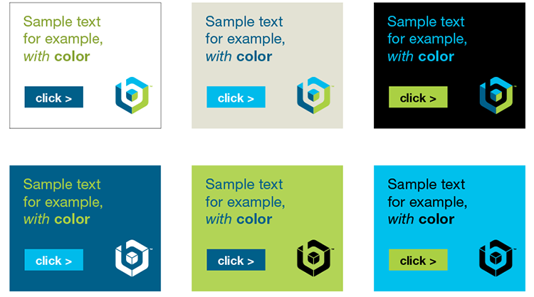
Color Balance
Color hierarchy is a crucial element of brand consistency.
Teal with cerulean, lime, orange, and fuchsia form the base of the brand colors. Neutral shades and accent colors expand options within the palette.
This graphic illustrates the hierarchy of color.

Effective Color Combinations
These are ideal color combinations to use in your designs. Maintaining the dark teal blue in each, accompanied by one or two accent colors, and balanced out with a neutral.

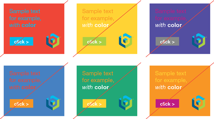
Color Usage & Accessibility
This palette uses strong, vibrant colors. As such, a little goes a long way. The colors have the most impact when used sparingly and appropriately—they can speak boldly on their own or in pairs but begin to fight each other when combined in excess.
In general, don’t combine multiple colors on one layout. Pair bright accent colors with grounded neutral colors and use minimalism to emphasize the color being used.
Contrast and Accessibility
Care must be taken to use color combinations with appropriate
contrast. Too little contrast will render the content unreadable
on certain devices or by those with vision impairments.