Visualizing Scientific Big Data in Informative and Interactive Ways
Brookhaven Lab computer scientist Wei Xu develops visualization tools for analyzing large and varied datasets
March 31, 2017
 enlarge
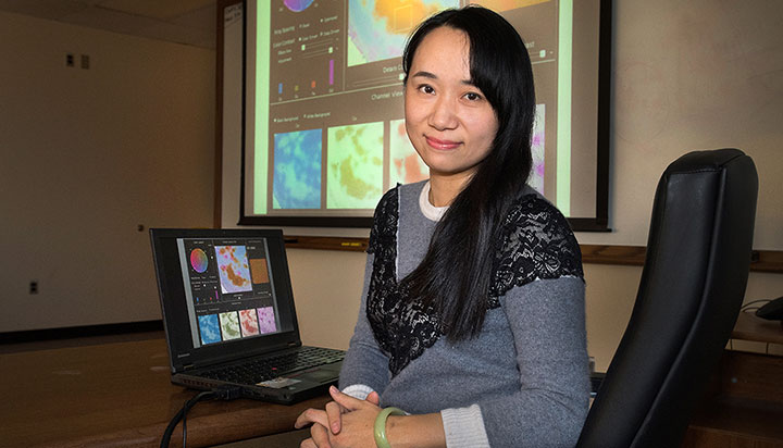
Wei Xu, a computer scientist who is part of Brookhaven Lab¹s Computational Science Initiative, helps scientists analyze large and varied datasets by developing visualization tools, such as the color-mapping tool seen projected from her laptop onto the large screen.
“Visual analytics provides a bridge between advanced computational capabilities and human knowledge and judgment,” said Wei Xu, a computer scientist in the Computational Science Initiative (CSI) at the U.S. Department of Energy’s (DOE) Brookhaven National Laboratory and a research assistant professor in the Department of Computer Science at Stony Brook University. “The interactive visual representations and interfaces enable users to efficiently explore and gain insights from massive datasets.”
At Brookhaven, Xu has been leading the development of several visual analytics tools to facilitate the scientific decision-making and discovery process. She works closely with Brookhaven scientists, particularly those at the National Synchrotron Light Source II (NSLS-II) and the Center for Functional Nanomaterials (CFN)—both DOE Office of Science User Facilities. By talking to researchers early on, Xu learns about their data analysis challenges and requirements. She continues the conversation throughout the development process, demoing initial prototypes and making refinements based on their feedback. She also does her own research and proposes innovative visual analytics methods to the scientists.
Recently, Xu has been collaborating with the Visual Analytics and Imaging (VAI) Lab at Stony Brook University—her alma mater, where she completed doctoral work in computed tomography with graphics processing unit (GPU)-accelerated computing.
Though Xu continued work in these and related fields when she first joined Brookhaven Lab in 2013, she switched her focus to visualization by the end of 2015.
“I realized how important visualization is to the big data era,” Xu said. “The visualization domain, especially information visualization, is flourishing, and I knew there would be lots of research directions to pursue because we are dealing with an unsolved problem: how can we most efficiently and effectively understand the data? That is a quite interesting problem not only in the scientific world but also in general.”
It was at this time that Xu was awarded a grant for a visualization project proposal she submitted to DOE’s Laboratory Directed Research and Development program, which funds innovative and creative research in areas of importance to the nation’s energy security. At the same time, Klaus Mueller—Xu’s PhD advisor at Stony Brook and director of the VAI Lab—was seeking to extend his research to a broader domain. Xu thought it would be a great opportunity to collaborate: she would present the visualization problem that originated from scientific experiments and potential approaches to solve it, and, in turn, doctoral students in Mueller’s lab would work with her and their professor to come up with cutting-edge solutions.
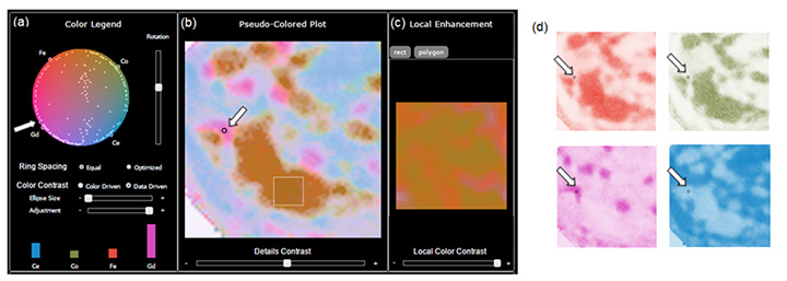
This Brookhaven-Stony Brook collaboration first led to the development of an automated method for mapping data involving multiple variables to color. Variables with a similar distribution of data points have similar colors. Users can manipulate the color maps, for example, enhancing the contrast to view the data in more detail. According to Xu, these maps would be helpful for any image dataset involving multiple variables.
 enlarge
The color-mapping tool was used to visualize a multivariable fluorescence dataset from the Hard X-ray Nanoprobe (HXN) beamline at Brookhaven's National Synchrotron Light Source II. The color map (a) shows how the different variables—the chemical elements cerium (Ce), cobalt (Co), iron (Fe), and gadolinium (Gd)—are distributed in a sample of an electrolyte material used in solid oxide fuel cells. The fluorescence spectrum of the selected data point (the circle indicated by the overlaid white arrows) is shown by the colored bars, with their height representing the relative elemental ratios. The fluorescence image (b), pseudo-colored based on the color map in (a), represents a joint colorization of the individual images in (d), whose colors are based on the four points at the circle boundary (a) for each of the four elements. The arrow indicates where new chemical phases can exist—something hard to detect when observing the individual plots (d). Enhancing the color contrast—for example, of the rectangular region in (b)—enables a more detailed view, in this case providing better contrast between Fe (red) and Co (green) in image (c).
“Different imaging modalities—such as fluorescence, differential phase contrasts, x-ray scattering, and tomography—would benefit from this technique, especially when integrating the results of these modalities,” she said. “Even subtle differences that are hard to identify in separate image displays, such as differences in elemental ratios, can be picked up with our tool—a capability essential for new scientific discovery.” Currently, Xu is trying to install the color mapping at NSLS-II beamlines, and advanced features will be added gradually.
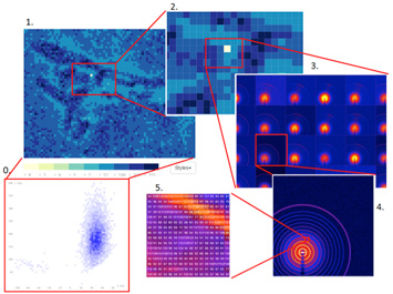
In conjunction with CFN scientists, the team is also developing a multilevel display for exploring large image sets. When scientists scan a sample, they generate one scattering image at each point within the sample, known as the raw image level. They can zoom in on this image to check the individual pixel values (the pixel level). For each raw image, scientific analysis tools are used to generate a series of attributes that represent the analyzed properties of the sample (the attribute level), with a scatterplot showing a pseudo-color map of any user-chosen attribute from the series—for example, the sample’s temperature or density. In the past, scientists had to hop between multiple plots to view these different levels. The interactive display under development will enable scientists to see all of these levels in a single view, making it easier to identify how the raw data are related and to analyze data across the entire scanned sample. Users will be able to zoom in and out on different levels of interest, similar to how Google Maps works.
 enlarge
The multilevel display tool enables scientists conducting scattering experiments to explore the resulting image sets at the scatterplot level (0), attribute pseudo-color level (1), zoom-in attribute level (2), raw image level (3), zoom-in raw image level (4), and pixel level (5), all in a single display.
“Scientists commonly describe a single object with datasets from different sources—each covering only a portion of the complete properties of that object—for example, the same sample scanned in different beamlines,” explained Xu. “With this tool, scientists can recover a property with missing fields by refining its potential ranges and interactively acquiring feedback about whether the result makes sense.”
Their research led to a paper that was published in the Institute of Electrical and Electronics Engineers (IEEE) journal Transactions on Visualization and Computer Graphics and awarded the Visual Analytics Science and Technology (VAST) Best Paper Honorable Mention at the 2016 IEEE VIS conference.
At this same conference, another group of VAI Lab students whom Xu worked with were awarded the Scientific Visualization (SciVis) Best Poster Honorable Mention for their poster, “Extending Scatterplots to Scalar Fields.” Their plotting technique helps users link correlations between attributes and data points in a single view, with contour lines that show how the numerical values of the attributes change. For their case study, the students demonstrated how the technique could help college applications select the right university by plotting the desired attributes (e.g., low tuition, high safety, small campus size) with different universities (e.g., University of Virginia, Stanford University, MIT). The closer a particular college is to some attribute, the higher that attribute value.
 enlarge
The scatter plots above are based on a dataset containing 46 universities with 14 attributes of interest for prospective students: academics, athletics, housing, location, nightlife, safety, transportation, weather, score, tuition, dining, PhD/faculty, population, and income. The large red nodes represent the attributes and the small blue points represent the universities; the contour lines (middle plot) show how the numerical values of the attributes change. This prospective student wants to attend a university with good academics (>9/10). Universities that meet this criterion are within the contours lines whose value exceeds 9. To determine which universities meet multiple criteria, students would see where the universities and attributes overlap (right plot).
According to Xu, this kind of technique also could be applied to visualize artificial neural networks—the deep learning (a type of machine learning) frameworks that are used to address problems such as image classification and speech recognition.
“Because neural network models have a complex structure, it is hard to understand how their intrinsic learning process works and how they arrive at intermediate results, and thus quite challenging to debug them,” explained Xu. “Neural networks are still largely regarded as black boxes. Visualization tools like this one could help researchers get a better idea of their model’s performance.”
Besides her Stony Brook collaborations, Xu is currently involved in the Co-Design Center for Online Data Analysis and Reduction at the Exascale (CODAR), which Brookhaven is partnering on with other national laboratories and universities through DOE’s Exascale Computing Project. Her role is to visualize data evaluating the performance of computing clusters, applications, and workflows that the CODAR team is developing to analyze and reduce data online before the data are written to disk for possible further offline analysis. Exascale computer systems are projected to provide unprecedented increases in computational speed but the input/output (I/O) rates of transferring the computed results to storage disks are not expected to keep pace, so it will be infeasible for scientists to save all of their scientific results for offline analysis. Xu’s visualization will help the team “diagnose” any performance issues with the computation processes, including individual application execution, computation job management in the clusters, I/O performance in the runtime system, and data reduction and reconstruction efficiency.
Xu is also part of a CSI effort to build a virtual reality (VR) lab for an interactive data visualization experience. “It would be a more natural way to observe and interact with data. VR techniques replicate a realistic and immersive 3D environment,” she said.
For Xu, her passion for visualization most likely stemmed from an early interest in drawing.
“As a child, I liked to draw,” she said. “In growing up, I took my drawings from paper to the computer.”
Brookhaven National Laboratory is supported by the Office of Science of the U.S. Department of Energy. The Office of Science is the single largest supporter of basic research in the physical sciences in the United States, and is working to address some of the most pressing challenges of our time. For more information, please visit science.energy.gov.
2017-12074 | INT/EXT | Newsroom


